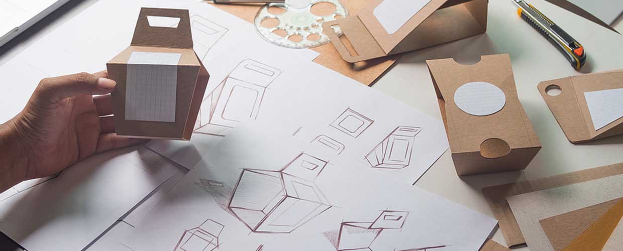
Design Not Decoration
Design has been “misconstrued as decoration or as an embellishment.”
—Paola Antonelli, Senior Curator and Director of Research and Development, MoMA, in an interview.
It happens in many fields—whether in the production of a brochure, the renovation of an interior, or the building of an application feature—that “design” is often brought late to the table to prettify, decorate, or add “touch and feel” to something that was always already designed. Because the moment you begin to lay out the content, structure, and form of something, you are engaged in the act of design whether you know it or not and whether or not you are any good at it.
Bringing someone in later, after key decisions are made, someone with special competence in doing those things, to fix or make look good the outcome of those decisions, will almost always waste time, lead to deep frustration, and ultimately make it difficult to accomplish what you wanted to accomplish in the first place. Because design is about all those decisions, and making them at the right time—design is not “decorative sauce poured on top of content” (to paraphrase the photographer Stephen Shore).
For Kindling, design itself shows the meaning and message of Kindling. This formula has been echoed in writing about design, art, literature, and music for over a hundred years; the poet Robert Creeley, for example, said that “Form is never more than a projection of content” (by which he meant of course that form is never less than an expression of content either). For form or design to be an expression of content, the designer must be brought into the project early, and from the beginning develop the form through an understanding of that content.
And the content itself is likely in turn to be affected by this interaction. To take an example from application design, suppose that a customer wants to customize an idea capture form; before even interacting with design—and here I mean the broader idea of design in software including visual and interactive and application design—a decision is made and there is a specification (and so we have the content of the thing); and then the designers are brought in to make it work. But if the designers were brought in before this point, their special competence may point out flaws in the original assumption, and further point to ways to satisfy what the customer wanted in the first place, while making decisions that add more useful functionality integrated into the application as a whole.
To take that thought one step further, into a larger experience of life: “There are those who believe that the role the designer must play is fixed and determined by the socio-economic climate; that he must discover his functional niche and fit himself into it,” wrote the brilliant designer Paul Rand. “It seems to me that this ready-made image ignores the part the artist can play in creating this climate” (“Integrity and Invention”). The worst situation for design is to try to fix bad decisions that have already been made; the best use of design is to affect those decisions from the very beginning towards a better human experience. This is how we work at Kindling, where design is at the center of our mission. And the climate that Rand speaks of is to us one of enjoyment.
Addressing Human Experience
Originally an accounting symbol, the @ symbol was appropriated in a design of the email protocol by Ray Tomlinson in 1971.
The @ symbol was used to replace a complex relationship otherwise represented by many lines of code with one character. Do we recognize in this act the pretty? The decorative? The jazzy? No, purchased by MoMA in 2012 and added to its permanent collection, MoMA cited its “elegance, economy, intellectual transparency, and a sense of the possible future directions that are embedded in the arts of our time.”
How could a keyboard character be in a design collection? It’s not beautiful, not eye-catching, it doesn’t stand out among all the other little things and say Look at me. But when you think about it, this act of taking complexity and reducing it to something simple, quickly understandable, and eventually so self-evident as to become transparent is a paramount example of the act of design. And this, I think, is beautiful.
In the interview mentioned above, Antonelli notes that renewed attention has been in fact brought to design in the United States in the last several years, most significantly through Jobs and Apple. Yet she’s clear in emphasizing that design is not about objects, but about interactions: “it’s so important to make people understand that interfaces, the ATM machine, and the interface of your phone, visualisation design, that they’re such important parts of our time.” And that’s the thing: design is not concerned with the mere appearance of something but with an experience of something, an experience in and of our time.
And so we come back to the idea that design ought to be brought to the conversation early, to affect the decisions that together make up our experience. At Kindling we made that our mission and it imbues every part of our culture: to improve the experience of others, especially by throwing away legacy ideas that are not working any more, and focusing on the individual’s enjoyment.

